

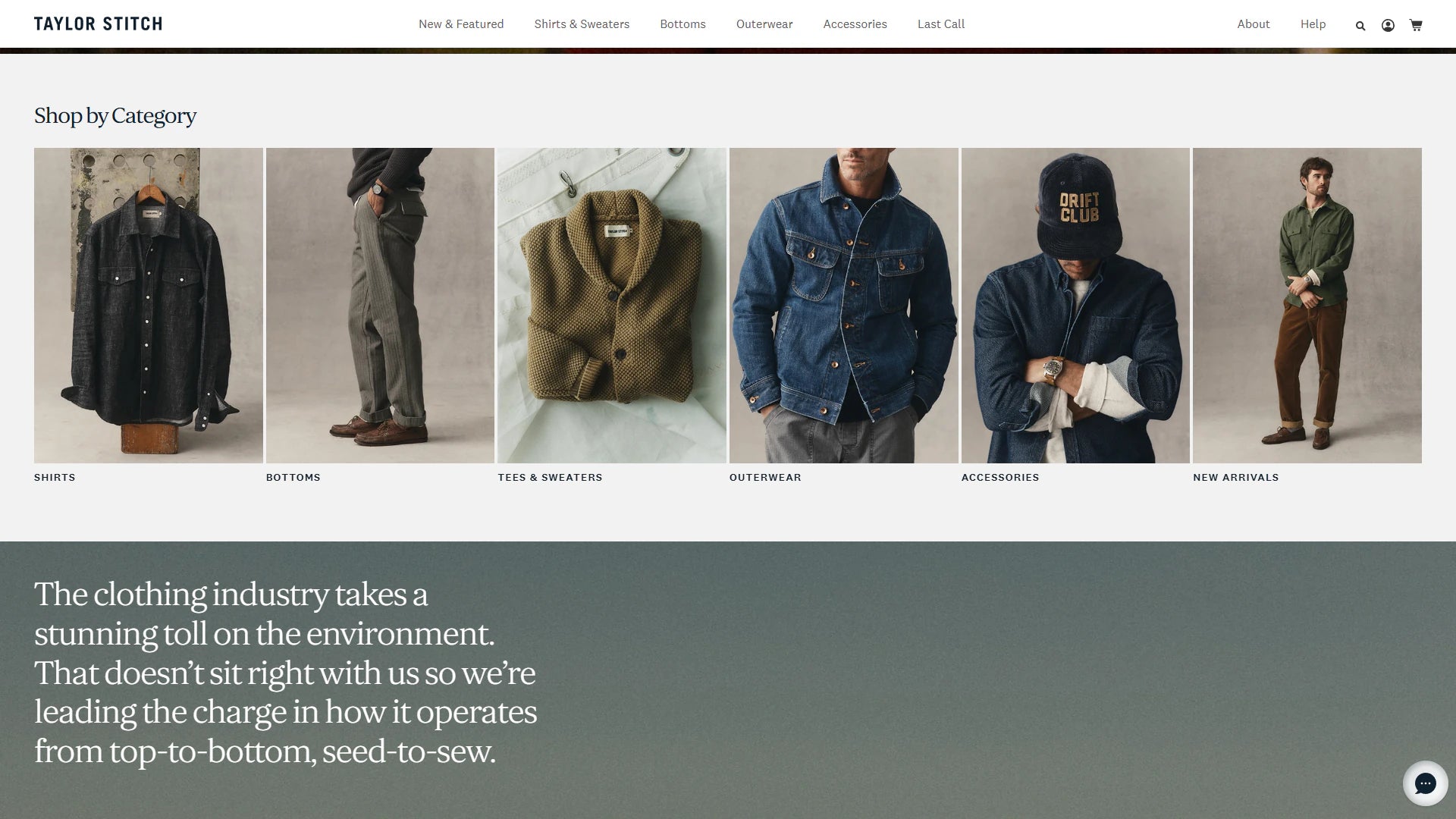
Selected Shopify work
Taylor Stitch
Explore the storefront and the published project scope for Taylor Stitch.
Shopify storefronts for fashion teams balancing brand storytelling, seasonal merchandising, fit confidence and complex variant availability.
Explore the storefront and the published project scope for Taylor Stitch.
Fashion customers move quickly between editorial inspiration and practical questions about fit, fabric, color and availability. The storefront has to keep that context clear across collection, product and mobile journeys while giving merchandisers room to change a season without developer intervention.
Place sizing, fabrication and variant guidance where uncertainty appears.
Connect campaign storytelling with shoppable collections and products.
Use filters, search and navigation that reflect how customers shop the range.
Build reusable sections for drops, lookbooks and seasonal stories.
Start with the garments customers struggle to choose. A useful fashion brief connects product measurements, photography, size availability and returns questions to the way the team launches a collection.
Separate body measurements from garment measurements and state which the size chart uses. Record fit notes, model measurements, fabric composition and care information alongside each product family. A customer comparing two cuts should be able to understand the difference without opening a support conversation.
Deliverable: a product-content template and size-guide rules for the relevant categories.
Plan where a lookbook leads when one item sells out. Give the merchant team controls for featured outfits, collection order and replacement products. Keep essential collection links available outside an image so that shoppers and search engines can follow them.
Deliverable: a collection map, campaign section library and sold-out merchandising plan.
Selecting a colour should update the correct imagery and preserve a valid size selection. Check unavailable combinations, product links that preselect a variant, and back-in-stock messaging. Distinguish a temporarily unavailable size from a discontinued item before deciding how it should appear.
Acceptance check: collection, product page and cart show the same selected variant and availability.
Document how to add a collection, assign size guidance, replace campaign imagery and retire a seasonal page. Review mobile filters with the actual range, including long colour names and sizes that are unavailable. Use return reasons and search queries to choose the next improvement.
Bring to discovery: representative products, the launch calendar and anonymized fit or returns questions.
Shape fit, collection and editorial journeys together.
ServiceBuild flexible campaign and product templates.
ServiceHelp customers narrow large ranges without losing context.
ServiceUse customer evidence to prioritize product discovery, product-page, cart and mobile journey improvements without promising an untested uplift.
These are tools and platform features to evaluate for the requirements described on this page. The scope identifies which are appropriate, which are unnecessary and who will maintain them.
Use Shopify’s Search & Discovery filter guidance when planning attributes and collection discovery.
Keep the active variant, fit guidance and buying action close together without covering product media or forcing repeated scrolling.
Yes. Lookbooks, campaign modules and collection storytelling can use reusable Online Store 2.0 sections and metaobjects.
Variant, inventory and media behavior is mapped before UI work so unavailable combinations and deep links remain predictable.
Use shared components for price, variants and buying actions, then vary the information that affects the decision. Denim may need inseam and rise guidance; knitwear may need texture, layering and care detail. Separate templates only where the content or journey requires them.
Decide whether it still provides useful editorial information, should link to a successor collection or should be retired. Avoid leaving a prominent campaign full of dead product links. Redirect decisions should follow the page purpose and its relevant replacement.
Start with high-traffic collections and products where fit questions, unavailable variants or exits suggest friction. Compare mobile and desktop behaviour, then test a focused change. A visual redesign alone does not establish that a shopping problem has been solved.
Share the current store, target customer and the commercial constraint the next phase needs to solve.
Start a Project